
You just wrapped a week visiting four stores.
Notes in two apps. A half-built spreadsheet. And you still can't give your VP a straight answer on which location is actually slipping.
That's not a you problem. That's a visibility problem.
Most multi-unit operators have data. What they don't have is the right data, for the right person, at the right time. That's what an operations dashboard is supposed to fix.
A good one tells your store manager what needs to happen before the shift ends. It tells your district manager which location is drifting before it becomes a problem. It tells your COO which region needs attention without three reports and a status call to figure it out.
This article walks through 16 real operations dashboard examples, organized by function. Each one covers who uses it, what it shows, and what problem it actually solves. Use it as a reference whether you're building your first dashboard or figuring out why the ones you have aren't working.

.svg)

Priced on per user or per location basis
Available on iOS, Android and Web


Related resources
- Operational dashboard best practices for multi-location teams
- How operational dashboards differ from analytics dashboards
- How to run monthly ops reviews that drive action
- Dashboard metrics for retail operational excellence
- Restaurant dashboards: what to track and why
- Balanced scorecards and operational dashboards explained
What is an operations dashboard?
An operations dashboard is a real-time view of what's happening across your locations, teams, or functions. It pulls data from the tools your team uses daily and shows it in one place so managers don't have to go hunting for it.
In multi-location businesses like restaurant groups, retail chains, or C-store networks, operations dashboards replace three things most teams rely on too much:
- Weekly status calls that eat half the week
- Manual spreadsheets nobody fully trusts
- Reactive site visits triggered by complaints rather than data
A good operations dashboard isn't just a pretty interface. It shows something you can act on. A number that sits on a screen without telling you what to do next isn't useful. It's noise.
If you want to understand the difference between a dashboard built for action vs. one built for reporting, operational dashboards vs analytics dashboards is worth a quick read before you start building.
Why operations dashboards matter for multi-unit businesses
Running one location is hard. Running 10, 20, or 50 is a completely different problem.
You can't be everywhere. You can't ask every store manager what happened this morning. You can't catch a compliance drift at location 14 by instinct alone. You need systems that surface the right information before small issues turn into serious ones.
Here's what teams do without the right dashboards, and what replaces it when they have them:
**
Without dashboards, With dashboards
Weekly status calls with every store manager, A live view that updates throughout the day
Manual Excel reports built from data exports, Automated widgets pulling from real-time sources
Reactive site visits triggered by a complaint, Proactive visits guided by trend data
Guessing which location needs the most attention, Ranked performance data by location or region
Chasing corrective action follow-up manually, A live view tracking close-out status
**
The results compound. When a district manager spends less time chasing status updates, they spend more time at the stores that actually need them. When a COO sees a trend dashboard every Monday, they catch a regional compliance drift two months before it becomes an audit failure.
For a practical look at how this plays out across a full location network, multi-unit operations execution covers the operational visibility layer in detail.
Types of operations dashboards
Before jumping into the examples, here's how they break down by category.
Daily operations dashboards track task completion, checklist status, and shift-level activity. These are the ones frontline managers check every day.
Audit and quality dashboards track inspection scores, flagged items, and brand standard execution across locations. District managers and QA teams use these most.
Corrective action dashboards track whether issues actually get fixed after they're flagged. Without these, corrective actions fall into a void.
Role-based dashboards are custom views built for a specific title. An area director sees different data than a CEO. Both see only what they need to make decisions.
Specialized dashboards cover specific functions like temperature monitoring, work orders, communications compliance, or food and beverage operations.
The 16 examples below sit within these five categories.
Operations dashboard examples by function
Daily operations visibility
1. Location pulse dashboard
This is the most common starting point for store-level teams.
It gives a store manager or shift lead a real-time snapshot of their single location. Open tasks, in-progress checklists, missed items, photos submitted from the location that day. Everything that matters right now, on their phone, in one view.
It sounds simple. It is. That's exactly why it works.
Without it, a manager ends a shift by walking around asking team members what got done. With it, they see the full picture in 30 seconds. Missed a closing task? They know before they leave. Photo documentation incomplete? Caught before the next shift walks in.
Who uses it: Store managers, shift leads, frontline supervisors
What it shows:
- Open, in-progress, and missed tasks for the current shift
- Checklist completion status by category
- Photos submitted from the location
- Items flagged for follow-up
Real use case: A closing manager checks the dashboard at 9 PM. Two tasks are still open. She assigns them before leaving. The opening manager tomorrow starts clean instead of inheriting yesterday's unfinished work.
The Xenia task management platform powers this view for restaurant, retail, and C-store teams, with role-based permissions so each manager only sees their location.
2. Daily compliance report dashboard
This is a multi-location rollup of checklist completions across every location, every day.
Opening procedures. Closing procedures. Temperature logs. Safety checks. Everything that's supposed to happen daily, across every store, in one view. Common among C-store operators running lean management teams across a large footprint. Some have this emailed to them automatically at end of day.
The value isn't just tracking who did what. It's the pattern underneath.
Which locations miss the same checklist every Tuesday? Which ones have never once submitted a full opening procedure on time? You can't see that in a single day's data. You need the daily view repeated across weeks to catch it.
Who uses it: Regional managers, directors of operations, C-store multi-unit operators
What it shows:
- Checklist completion across all locations for the current day
- Which locations completed vs. missed each procedure
- 30-day completion rate history by location
For C-store operators specifically, convenience store operations shows how this daily compliance layer gets applied across high-footprint networks.
3. Completion metrics dashboard
This goes deeper than the daily compliance dashboard. Instead of showing you today, it shows you what's been happening over time.
Completion rates for all recurring scheduled work, broken down by region, district, and location. Filterable by date range and task type. Pull a 30-day view for a specific district and see whether completion rates have gone up, gone down, or flatlined.
Here's where it gets useful. A district manager notices two locations dropped in completion rates around the same three-week window. That's not a coincidence. It usually points to a staffing change, a training gap, or a management issue at those stores. Without the trend view, you'd never connect the dots.
Who uses it: District managers, directors of operations, area directors
What it shows:
- Completion rates by location, district, and region
- Trend direction over a selected date range
- Breakdown by task category or checklist type
- Locations falling below a set threshold
Xenia's frontline reporting module powers this view with real-time widgets. No exports required.
Audit and quality visibility
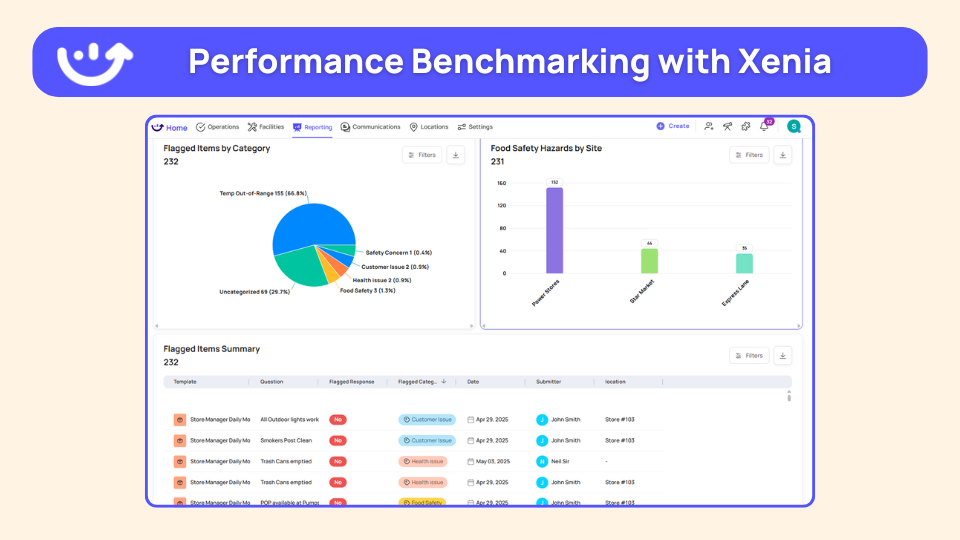
4. Audit insights dashboard
If you run audits across multiple locations, this is the dashboard that makes those audits worth running.
It tracks inspection scores across all locations. Average score by section, most commonly flagged items, and pass/fail ratings by location. The feature that makes it genuinely useful is the drill-down. Regional average down to a single store's most recent audit in two clicks.
That matters because aggregated scores hide the real picture. A district average of 87% looks fine. Then you drill down and see one location pulling the number up while two others fail the same food safety section every single audit.
To understand how scoring methodology affects what your audit insights dashboard actually shows, weighted scoring explained is worth reading before you configure your audit forms.
Who uses it: Quality assurance managers, district managers, directors of operations
**
Dashboard view, What it answers
Regional average score, How is the overall region performing?
Most flagged issues by category, What problems keep showing up across locations?
Location-level audit history, Which stores are trending up or down?
Section-level breakdown, Where do auditors find the most issues?
**
Xenia's audits and inspections software feeds directly into this dashboard view, with photo evidence, flagged responses, and corrective action triggers built in.
5. Brand standards dashboard
Built specifically for franchise and multi-brand operators.
The difference between this and a general audit dashboard is framing. A general audit dashboard tracks whether things got done. A brand standards dashboard tracks whether each store is executing against the specific baseline that defines what the brand is supposed to look and feel like.
For a franchise group with 60 locations, knowing a new franchisee's current score isn't enough. You need to know whether that score is trending up or down month over month. Are they improving after onboarding support? Starting to slip six months in when close attention drops off? That's what this dashboard tracks.
Who uses it: Franchise operations teams, brand standards managers, regional directors
What it shows:
- Compliance score by location against the brand standard baseline
- Month-over-month trend per franchisee or location
- Locations flagged for underperformance
- Network-wide benchmarking
Xenia's brand standards compliance tool is built for exactly this use case. The brand standards audit guide also covers how to structure your scoring framework before you build the dashboard.
6. Trend analysis dashboard
Every audit dashboard shows you where you are. This one shows you where you're going.
A 30-day or 90-day view of performance across stores or districts. Audit scores, task completion rates, or both. The main use case is early warning.
A location that fails one audit might have had a rough week. A location whose scores have dropped for three straight months has a problem that's been building quietly. The trend dashboard is how you catch the second type before it becomes a serious issue.
It's also how you measure whether a change actually worked. Updated your onboarding process two months ago? The trend view tells you whether compliance scores at recently onboarded locations actually improved.
Who uses it: VPs of operations, directors of operations, C-store multi-unit operators
What it shows:
- Performance over a selected time window: 30, 60, or 90 days
- Score direction by location, district, or region
- Top and bottom performer comparison over time
- Score movement before and after operational changes
If you're thinking about how trend dashboards fit into a broader review cadence, monthly ops reviews is a good companion read.
Corrective action and issue management
7. Corrective action dashboard
This is one of the most underused dashboard types in multi-location operations. It's also one of the most important.
Audits flag issues. Checklists flag issues. Inspections flag issues. What happens next is where most operations teams fall apart completely.
The corrective action dashboard surfaces all open corrective tasks across locations, grouped by location, category, and close-out status. The problem it solves is simple: operators know when an issue gets flagged. They rarely know if anyone fixed it. Following up manually across 20 or 30 locations requires a dedicated person doing nothing but chasing. This dashboard replaces that with a live view that updates as tasks get closed.
Who uses it: Operations managers, district managers, compliance teams
What it shows:
- All open corrective actions across every location
- Category grouping: food safety, cleanliness, equipment, vendor-related
- Days open and close-out status per action
- Who it's assigned to and whether it's overdue
The full corrective action tracking workflow, from flagged item to closed task, is documented in Xenia's audit hub. The corrective action process article also covers how to structure the workflow before you need the dashboard to track it.
8. Work order status dashboard
This covers facilities and maintenance specifically.
All work orders by status: open, in-progress, completed, missed. Filterable by location, priority level, and how the work order was created. That last filter matters more than it sounds. A work order triggered automatically from a failed checklist item tells a different story than an ad hoc request a store manager submitted.
The most common reason area directors ask for this dashboard: they manage both operations and facilities and they're tired of toggling between two tools to see a combined picture. Task completion and work order status on the same screen cuts the number of places they have to look in half.
Who uses it: Area directors, facilities managers, operations directors managing physical assets
**
Work order status, What gets tracked
Open, Volume by location-how long they've been sitting open
In-progress, Assigned technician-expected completion date
Completed, Close-out rate-average resolution time
Overdue, Work orders past their due date by location
**
Xenia's work order software feeds this dashboard directly, with automated routing and location-level filtering built in. For restaurant operators specifically, multi-location work order management covers how this works across a distributed footprint.
Role-based and custom views
9. Area director dashboard
Area directors typically manage 5 to 7 locations. They need more detail than an executive dashboard but less noise than a store-level view.
This dashboard shows task completion rates, audit scores, open work orders, and overdue items across their specific set of locations. Not the whole organization. Not one store. Their locations, in one view, updated in real time.
A well-configured area director dashboard replaces a weekly status call, a shared spreadsheet, and two separate tools. Instead of chasing each store manager for updates, they see everything before their first site visit of the week. They walk in knowing exactly what to focus on.
Who uses it: Area directors, district managers
What it shows:
- Task completion rate across their location set
- Audit scores and trend direction by location
- Open work orders and corrective actions
- Overdue items flagged by location
Xenia's district and regional leaders product page covers how this role-based view gets configured for area directors managing mixed-format location sets.
10. Executive / CEO dashboard
This dashboard is not for investigation. It's for pattern recognition and exception alerts.
A COO doesn't need to see every missed task. They need to know which region is underperforming and whether it's getting worse. This dashboard shows KPIs at the organizational level: completion rates by region, average audit scores, incident volume, open corrective actions, and trend direction.
The design principle here is restraint. Every metric you add reduces the signal-to-noise ratio. The best executive dashboards show five to eight genuinely decision-relevant numbers with the ability to drill down if something looks off.
Who uses it: COOs, VPs of operations, CEOs of multi-unit operators
**
Executive dashboard metric, What it tells you
Completion rate by region, Which regions keep up with daily operations
Average audit score trend, Whether quality is improving or declining
Open corrective actions by location, Where issues go unresolved
Incident volume month over month, Whether safety or compliance issues are growing
**
For a broader look at how to set up KPIs that feed a meaningful executive view, operational dashboard best practices covers the metric selection process in detail.
11. Employee productivity dashboard
This tracks task completion by individual employee. Not by location. Not by role. By person.
Store managers use it to compare output across a shift team. District managers use it to spot consistent high performers and people who may need more support. It's less about catching people doing less work and more about making sure workload is distributed fairly and training gaps get addressed before they become performance issues.
If one employee consistently completes significantly fewer tasks than their peers on the same shift, that's a signal. It might be a training issue. It might be a scheduling issue. It's almost never a coincidence.
Who uses it: Store managers, district managers, HR and training leads
What it shows:
- Task completion volume by individual employee
- Comparison across team members on the same shift or location
- Trend over time per employee
- Gaps that may signal training needs
Xenia's employee accountability tool powers this view, with individual-level task tracking tied to role and location.
Specialized and industry-specific dashboards
12. Food and beverage operations dashboard
This one comes up specifically for operators running food and beverage alongside other retail categories or departments.
The problem with a general ops dashboard in that context: critical food safety metrics get buried under general store tasks. Temperature logs, prep checklists, and safety checks need their own view. They can't compete for screen space with planogram compliance or inventory receiving.
A food and beverage operations dashboard gives the F&B department head what they need, separate from everything else. Food safety data is visible and prioritized, not lost in a list of unrelated tasks.
Who uses it: Food and beverage managers, culinary operations directors, C-store operators running food programs
What it shows:
- Temperature log completion and sensor readings
- Food prep and station setup checklist status
- Food safety audit scores and flagged items
- Corrective actions specific to F&B compliance
Xenia's food safety software and HACCP temp log workflows feed directly into this dashboard type.
13. Field team dashboard
Field auditors and district managers conducting site visits across many locations need a view built for the road, not a desktop.
The field team dashboard shows assigned locations for the period, audit status by location, outstanding corrective actions from prior visits, and submission history. Designed for phone use from the start.
Before walking into a location, a field auditor pulls this up and sees exactly what was flagged last time, whether corrective actions were closed, and what the current completion rate looks like. That 90 seconds of prep turns a general walkthrough into a targeted visit with a clear agenda.
Who uses it: Field auditors, district managers, operations leads conducting multi-location visits
What it shows:
- Assigned locations for the current period
- Audit status per location: scheduled, in-progress, or completed
- Outstanding corrective actions from prior visits
- Submission history and score trend per location
Xenia's audit and inspection tools are built mobile-first for exactly this workflow, with offline capability so field teams can work in locations with poor connectivity.
14. Property inspections dashboard
Common in hospitality and property management, this dashboard tracks physical condition across locations, not task completion.
Inspection scores, flagged items by category, and submission history over time. For operators managing multiple properties where condition standards need to stay consistent, this view makes it possible to track whether a location is getting better or worse without pulling individual reports for each one.
It's also the right dashboard for operators who need to demonstrate inspection compliance to an external party: a franchisor, a health authority, or a property owner.
Who uses it: Facilities managers, property directors, hospitality operations teams
What it shows:
- Inspection scores by property and category
- Flagged items by type: structural, cleanliness, equipment condition
- Submission history and open items
- Trend direction over the past 90 days
15. IoT and temperature monitoring dashboard
For food operators, this replaces manual temperature log walks with continuous, automated monitoring.
Real-time sensor data from refrigeration units, freezers, and holding equipment. Current readings, historical trends, and automatic alerts when a unit goes out of range. An out-of-range reading at 2 AM triggers an alert instead of getting discovered at the next scheduled check, which is usually after the damage is done.
Who uses it: Food safety managers, restaurant operations directors, C-store operators with large refrigeration footprints
**
Manual temp log approach, IoT temperature dashboard
Staff checks temperatures on a set schedule, Sensors monitor continuously-24 hours a day
Out-of-range readings found at next scheduled check, Immediate alert the moment a reading exceeds the threshold
Paper entry or manual digital log, Automatic data capture with a full historical record
No visibility between scheduled checks, Real-time view across every unit and every location
**
Xenia's temperature monitoring software handles this with Bluetooth sensor integration and automated alerts. The bluetooth thermometer setup guide covers how to get it running across a multi-location footprint. For C-store operators specifically, convenience store temperature monitoring is a relevant companion read.
16. Communications and sign-off dashboard
This tracks whether team members have actually read and acknowledged policy updates, training announcements, or procedure changes.
Most operations teams are good at sending communications. They're bad at knowing whether those communications landed. You can send an updated food handling procedure to 200 employees and have no idea who read it until someone gets cited in a health inspection for not following it.
A communications and sign-off dashboard shows, by location, who has acknowledged a communication and who hasn't. Before a new procedure goes live, you can see exactly which teams still need to complete sign-off. That's the difference between hoping people got the message and actually knowing they did.
Who uses it: Operations directors, compliance managers, district managers rolling out new procedures
What it shows:
- Sign-off rate by location and by individual employee
- Outstanding acknowledgments before a rollout deadline
- History of sent communications and completion rates
- Locations or individuals who consistently lag on acknowledgments
Xenia's frontline communication module handles this, including mandatory sign-off and read-receipt tracking. The safety alert acknowledgment workflow shows a practical example of how this works for compliance-critical communications.
How to pick the right operations dashboards for your business
Don't start by building 12 dashboards. You'll overwhelm your team and end up with views nobody opens.
Here's a simple way to decide what to build first.
Start with the role, not the data. Ask who needs information and what decision they're trying to make with it. Match the dashboard type to that decision, not to what data you happen to have available.
Find your biggest visibility gap. Where are you flying blind right now? Daily task completion? Audit trends? Whether corrective actions got closed? Start with the gap that costs you the most time or creates the most risk.
Pick two or three, not ten. Get two dashboards working well before adding more. A location pulse dashboard and a daily compliance dashboard will do more for most operations teams than ten dashboards nobody trusts.
Check your data source first. A dashboard is only as good as the data feeding it. If your teams aren't completing checklists consistently, or if task data lives in a tool that doesn't connect to your reporting layer, the dashboard shows you gaps instead of insights.
**
Your biggest visibility gap, Start with this dashboard
Store-level task accountability, Location pulse dashboard
Multi-location compliance visibility, Daily compliance report dashboard
Audit quality and issue trends, Audit insights dashboard
Corrective action follow-through, Corrective action dashboard
Executive performance overview, Executive or CEO dashboard
Food safety documentation gaps, IoT and temperature monitoring dashboard
**
Common operations dashboard mistakes to avoid
Even the right dashboard fails when it's built wrong. These are the mistakes that come up most often.
Showing the same view to every role. A GM and a COO have completely different information needs. One dashboard for everyone serves nobody well.
Relying on manual data pulls. If someone exports a file, pastes it into a spreadsheet, and emails it around, that's a report. A real operations dashboard updates without any of that.
Tracking too many metrics at once. More data does not mean more clarity. The best dashboards show fewer, highly relevant numbers. Not every number that exists.
Building dashboards before fixing data collection. Garbage in, garbage out. Before investing in dashboard configuration, make sure the underlying task and checklist data is being captured consistently. Xenia's checklists and SOPs tool is the right starting point if your data collection process isn't solid yet.
Ignoring mobile. For frontline operations teams, most dashboard use happens on a phone. If it isn't optimized for mobile, field managers and store-level teams won't use it. Xenia's mobile app is built for exactly this, with the full dashboard and reporting layer accessible from any device.
How Xenia brings these dashboards together for multi-location teams
Most operations tools make you choose between depth at the location level and breadth across the organization. Xenia's custom dashboard builder lets you configure role-specific views using widgets built around the data your team actually collects. Task completion, audit scores, corrective action status, work order volume. All updating in real time. No exports. No spreadsheet work in between.
Xenia is an operations execution platform built for multi-unit operators in restaurants, retail, and convenience stores. It handles checklists, audits, corrective actions, work orders, and IoT temperature monitoring. It's not a scheduling or payroll tool. For teams already using workforce management and HR tools, Xenia covers the operational visibility layer those platforms don't.
Want to see what this looks like for your operation? Book a walkthrough.
Conclusion
Most multi-unit operations teams don't have a data problem. They have a visibility problem.
The data is there. It's scattered, delayed, or formatted for the wrong audience.
The right dashboard setup fixes that. Not by adding more reports. By getting the right numbers in front of the right people without manual work in between.
Start with the gap that costs you the most. Build two dashboards that actually get used. Then grow from there.
If you're ready to stop exporting spreadsheets and start seeing your operations in real time, Xenia is built for exactly that.
Multi-location teams in restaurants, retail, and convenience stores use it to configure role-specific dashboards, track execution across every location, and catch issues before they compound.
Book a walkthrough and see what your operation looks like with the right visibility layer in place.
Frequently Asked Questions
Got a question? Find our FAQs here. If your question hasn't been answered here, contact us.
What is the biggest sign your team needs better operations dashboards?
People are building their own reports in Excel. When managers spend time pulling data, formatting it, and emailing it around every week, that's the clearest sign the visibility layer is broken. The data exists. It just isn't organized in a way anyone can act on quickly.
Can you build operations dashboards without a dedicated IT team?
Yes. Modern operations platforms let managers configure dashboards using drag-and-drop widget builders. You pick the metrics, set the filters, and assign the view to a role. No coding. No IT ticket. Most teams have their first dashboard live within a day.
Should operations dashboards replace regular store visits?
No. A dashboard tells you a location's audit scores dropped for three straight months. It can't tell you why. It can't tell you whether the team is burned out or whether the new manager is struggling. Visits still matter. Dashboards just make them more targeted.
How often should operations dashboard data update?
Depends on what you're tracking. Task completion, temperature readings, checklist status need to update in real time or same day. Trend analysis and score benchmarking are fine on a weekly or monthly refresh. The more time-sensitive the data, the more often it needs to update.
What is the difference between an operations dashboard and a reporting tool?
A dashboard is always on. It shows you live data in a view you check every day. A reporting tool generates a snapshot when you ask for it. Think of dashboards as your daily monitor and reports as your monthly review.


A Modern, AI-Powered Platform Built Specifically for Frontline Operations
Xenia brings daily operations, maintenance, audits, and compliance into one mobile-first platform. Frontline teams execute work consistently across locations while leadership gets real-time visibility.
Why Multi-Location Operators Choose Xenia:
🤖 AI-Powered Operations, Create digital checklists instantly or convert paper forms with AI. Verify compliance automatically with photo analysis and get instant answers from your operational data.
✅ Daily Operations & Maintenance, Assign work across hundreds of locations in minutes. Report and route issues instantly. Schedule preventive maintenance to catch problems before downtime.
📊 Real-Time Visibility, Track completion, work orders, and performance across all locations through dashboards. Filter by site or asset to spot trends and take action.
Manage operations, maintenance, and compliance across all your locations from one platform

.webp)
%201%20(1).webp)

.svg)
%201%20(2).webp)