

Post Summary
What is an Operations Dashboard?
An operations dashboard is a centralized, real-time view of completion, audit, and issue data across every location a business runs. It pulls checklist completions, audit scores, corrective actions, and work order status into one screen. A manager or district lead sees which stores need attention before a small problem turns into a health-code violation, a lost sale, or a full-blown escalation.
For a multi-location operator, the dashboard replaces the DM's morning routine of calling five stores to ask how the open went. Instead of five phone calls, the DM opens one screen and already knows which locations are on track and which one needs a call first. That is the entire point of operations dashboard software: knowing what happened at every site without waiting for an end-of-week report to tell you.
An operations dashboard is not the same thing as a daily checklist or an audit, and the distinction matters if you landed here from a checklist search. Checklists and audits are where the data comes from. The dashboard is the rollup view that turns that data into a picture a manager can act on in minutes, not hours. For a closer look at how checklist data differs by industry, daily ops by vertical breaks down restaurant, c-store, retail, and hospitality routines side by side. And if you're trying to understand how dashboards, checklists, and audits fit together as one system instead of three disconnected tools, operations execution system covers that relationship directly.
.svg)

Priced on per user or per location basis
Available on iOS, Android and Web


Why Every Business Needs an Operations Dashboard
A business needs an operations dashboard because, without one, problems get discovered after they've already cost something: a failed inspection, a bad review, a shift that ran short-staffed with nobody upstream knowing until the next day.
A few concrete reasons this shows up in daily operations:
- Faster escalation. Instead of a DM finding a walk-in temp failure on their next scheduled store visit, an out-of-range reading shows up the same shift it happens, with a corrective task already assigned.
- Franchise consistency. Corporate sees completion and audit trends across every franchise unit, not just the ones a regional manager happens to visit that month.
- One version of the truth. Nobody is reconciling five spreadsheets that don't agree with each other by Friday.
- Less windshield time. A DM plans the day around what the dashboard flags, not a guess about which store is struggling.
The gap between operators who have this visibility and those who don't is real and measurable. The National Restaurant Association's 2026 State of the Restaurant Industry report found 60% of restaurant operators consider their business in the technology mainstream, while only 1 in 10 see themselves at the forefront, and just 26% report using AI-related tools at all, mostly for marketing.
The bigger shift is what a dashboard is supposed to show in the first place. A dashboard's job isn't to display a completion percentage that looks good in a slide deck. Multi-location operators care more about what's coming up as a problem, flagged items, open corrective actions, and locations trending toward a failure, before it becomes one. A store at 100% completion with three overdue corrective actions is a worse sign than a store at 92% with none open, and a dashboard built around completion percentage alone won't show you that.
Key Features of an Operations Dashboard
The features that actually matter on an operations dashboard are the ones that surface problems, not the ones that just track whether a task got checked off.
At minimum, a working operations dashboard should show:
- Flagged items and open corrective actions, sorted by how overdue they are, not buried in a report nobody opens.
- Audit score trend over time, not a single completion percentage that hides whether the 13% gap was a critical food safety miss or a smudged menu board.
- Work order status by location, so a cluster of maintenance tickets at one region shows up before it becomes five separate phone calls.
- Location hierarchy and scoped permissions, so a district manager sees their district, a regional sees their region, and nobody is digging through data that isn't theirs. Xenia's location hierarchy and scoped permissions work this way: one account, multiple views, no shared spreadsheets required.
- Real-time completion proof, photo and timestamp attached to the task, not a checkbox someone could have marked from memory.
- Custom views built from audit and checklist templates already in use, through tools like customizable dashboards and reporting, rather than a separate BI tool bolted on afterward.
One feature worth being precise about: an AI Template Agent that turns an uploaded SOP or audit PDF into a digital form, with conditional logic, required fields, and calculations included, is different from a tool that reads audit data and writes new SOPs on its own. The first exists today and saves real rollout time, cutting a franchise template build from weeks to days. The second doesn't exist in any credible product, and any dashboard vendor implying it should get a follow-up question in the demo.
Types of Operational Dashboards
There are two broad categories of operational dashboards, and the distinction is more useful for most operators than a long list of niche variants.
| Attribute | Operational Dashboard | Executive Dashboard |
|---|---|---|
| Metrics tracked | 20+ real-time metrics: completion %, flagged items, open corrective actions | 5-8 strategic KPIs: revenue, same-store sales, audit pass rate |
| Primary audience | Store managers, DMs, frontline supervisors | Regional VPs, corporate leadership |
| How it's used | Worked in actively, throughout the shift | Reviewed passively, usually weekly or monthly |
| Update frequency | Real-time or near real-time | Daily, weekly, or monthly rollup |
This framing, sourced from Domo's operational vs. executive dashboard breakdown, is the cleanest way to separate "the how" from "the why." An operational dashboard answers what's happening right now at the store level. An executive dashboard answers whether the business is trending in the right direction overall, usually as a rollup someone reviews once a week, not something a frontline manager checks between tasks.
Beyond that split, dashboards get built around specific jobs: a location-pulse view for daily completion, a corrective-action view for open tasks, a work-order view for maintenance backlog, an area-director rollup, an executive or CEO summary, and IoT or temperature-monitoring views for food safety. Each of these solves a narrower problem than a generic "operations dashboard" label suggests, and picking the wrong one is a common reason a dashboard rollout stalls after the first few weeks. Walking through all 16 of those types in detail would duplicate ground already covered in 16 real-world operations dashboard examples, which is worth a read if you're trying to figure out which type your team actually needs.
Real-world applications of Operational Dashboards
What an operations dashboard looks like in practice depends on the vertical, but the pattern is the same everywhere: surface the issue before it escalates, not after.
Restaurant
A regional ops director opens the dashboard at 7am and sees which of 40 units are below 90% on the opening checklist. Two stores have an open corrective action from last night's line check. One walk-in triggered a temp alert overnight, before the first DM call of the day even happens. Instead of waiting for a scheduled store visit to catch a slow slide, the dashboard shows which locations are trending toward a food safety problem days before it becomes one. That morning routine starts with the restaurant opening checklist at the store level, and the completion, temp, and corrective-action data from that checklist is what rolls up into the dashboard view corporate actually reads.
C-Store
An area manager's dashboard surfaces fuel price execution gaps by region and clusters of pump work orders in one view, the same issues-first logic applied to forecourt operations instead of a kitchen line. A cluster of three pump work orders in one region flags a vendor problem, not three unrelated equipment failures, a pattern a single site visit would rarely catch. Shift handoffs feed that dashboard directly through routines like a c-store shift handover checklist, so a pump problem flagged at close shows up on the area manager's screen before the next shift even clocks in, not three days later during a scheduled visit.
Retail
A district manager's dashboard shows planogram compliance by store and flags which banners are trending down, with photo-rollout variance surfaced in one gallery view instead of 80 separate store visits. A reference photo goes out for a new display, stores submit their own version back, and the dashboard sorts by closest match so the DM's next store walk focuses on the three outliers instead of guessing which of 80 locations needs a visit. Daily task completion, tracked through a retail closing checklist, sets up the metrics that show up on that dashboard the next morning. For a deeper look at which retail metrics belong on that view, see dashboard metrics for retail operational excellence.
Hospitality
A housekeeping director's dashboard tracks turn time trending against target and shows guest-request or maintenance backlog by property, so a slow turn at one hotel doesn't get discovered at checkout when a guest is already standing at the front desk. If turn times start drifting above target at one property while the others hold steady, that's a staffing or training gap worth catching this week, not next quarter's review. That data starts with routines like a hotel housekeeping pre-arrival checklist and rolls up into both a property-level view and a portfolio-level view for the regional team.
Challenges of Modern Multi-Location Operations
The three problems that keep multi-location operators from having real operational visibility are data fragmentation, inconsistent processes, and communication gaps.
Data fragmentation happens when temp logs live in one app, checklists are still on paper, and work orders come in over email or text. By the time a DM pieces it together into one picture, the pattern is already three weeks old and the store has moved on.
Inconsistent processes show up in a 40-unit chain where half the DMs are running their own version of the opening checklist because corporate's version never got enforced past the initial rollout email. Weighted audit scoring, where critical items count more than cosmetic ones, is one of the few tools that forces consistency back into that picture. Weighted audit scoring, explained covers why an 87% score can mean two very different things depending on what failed.
Communication gaps are the hardest to prove after the fact. A policy change goes out by email and nobody can say for certain who actually read it. Crunchtime, which absorbed Zenput, makes a version of this same point on its own product page: less than half of operators report having complete real-time visibility into food safety compliance. That's a vendor describing the problem their own tool is built to solve, worth citing as an industry admission, not an independent stat, but it lines up with what most multi-unit operators already know from experience running a 20-plus location footprint without a shared system.
How Xenia Revolutionizes Operational Visibility
Xenia's dashboard is built around the issues-first view described earlier: what's flagged, what's overdue, and which locations are trending toward a failure, not a wall of green checkmarks.
That shows up in a few specific ways:
- One account, scoped by role. Multi-location operations means a DM sees their district, a regional sees their region, and corporate sees everything, without separate logins or shared spreadsheets.
- Audits, daily ops, and work orders in one app. Operations management covers all three instead of gluing together a checklist tool, a separate maintenance system, and a group chat.
- Frontline communication feeds the dashboard directly. A policy acknowledgment, a checklist completion, and a corrective-action photo all show up in the same view through frontline communication and data collection, instead of living in three different inboxes.
- Audit failures roll up as a trend, not a stamp. Inspections and audits with weighted scoring feed the dashboard as a trend line, so a manager sees whether food safety is improving or slipping, not just last week's pass or fail.
- Corrective actions close the loop automatically. An audit failure or checklist exception can trigger a corrective task with an owner and a deadline, with escalation to the next level up if it's not closed in time. Most platforms collect the data. Fewer drive it to resolution.
- QR-code work requests connect the dashboard to maintenance. A broken cooler flagged during a corrective action becomes a routed QR code work request, no app install or phone call required.
- Flat per-location pricing. Xenia scales from $200 for one location down toward $30 per location at 500-plus sites, no per-form or per-seat penalty. Adding stores doesn't change the math the way it does with form-capped or per-seat pricing models.
Best Practices for Using Operational Dashboards
A dashboard only earns its keep if someone actually acts on what it shows, and most rollouts that fail don't fail on the software. They fail because nobody built a habit around checking it, so a handful of practices matter more than the length of the feature list.
- Review flagged items first, not the completion percentage. The percentage tells you what got done. The flagged list tells you what's about to go wrong, and that's the part worth ten minutes of a manager's morning.
- Pair every flag with a deadline and an escalation rule. A corrective action with no due date is just a note nobody reads twice, and it will sit open for weeks if nothing forces a decision.
- Scope views by role. A store manager needs their store. A regional needs the rollup. Nobody needs to dig through data that isn't theirs to act on, and over-sharing data just slows people down.
- Revisit the dashboard weekly with the team that owns it, not just the DM checking it alone between store visits. A five-minute weekly review turns a dashboard from a report into an actual habit.
These four cover the habits that make the biggest difference day to day. For a full walkthrough of 20 best practices and a six-step process for building a dashboard from scratch, see 20 best practices for building an operations dashboard.
Centralize and Streamline Your Operations
When a DM opens a Xenia dashboard at 7am, the first thing on the screen is a flagged item, not a wall of green checkmarks. That's the difference between a dashboard built for a slide deck and one built for a shift that starts in twenty minutes, and it's the standard every section above has been measuring against.
Newk's Eatery uses Xenia for audits and operations across 100+ locations, one system instead of a stack of separate reports that never quite agreed with each other. The same daily ops checklists that build the completion data feeding a location's dashboard are the routines a store team already runs every shift, opening, mid-shift, and closing, so the dashboard isn't a second system layered on top of the real work. It's a rollup of the work that was already happening.
If your current dashboard shows you what happened last week instead of what's happening right now, the fix isn't a bigger spreadsheet or another export button. It's one system that pulls checklists, audits, corrective actions, and work orders into a single, real-time operations dashboard, scoped to the person looking at it. Book a demo to see what that looks like across your own locations, with your own checklists and your own store list, not a canned walkthrough.
Frequently Asked Questions
Got a question? Find our FAQs here. If your question hasn't been answered here, contact us.
Who uses an operations dashboard, and does everyone see the same data?

How is an operations dashboard different from a daily checklist or an audit?
What metrics belong on a multi-location operations dashboard?
What is the difference between an operational dashboard and an executive dashboard?
How does an operations dashboard work for a multi-location business?
How real-time does an operations dashboard need to be to catch problems before they escalate?

A Modern, AI-Powered Platform Built Specifically for Frontline Operations
Xenia brings daily operations, maintenance, audits, and compliance into one mobile-first platform. Frontline teams execute work consistently across locations while leadership gets real-time visibility.
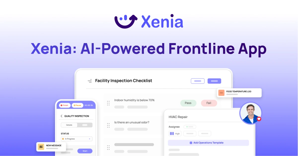
Why Multi-Location Operators Choose Xenia:
🤖 AI-Powered Operations, Create digital checklists instantly or convert paper forms with AI. Verify compliance automatically with photo analysis and get instant answers from your operational data.
✅ Daily Operations & Maintenance, Assign work across hundreds of locations in minutes. Report and route issues instantly. Schedule preventive maintenance to catch problems before downtime.
📊 Real-Time Visibility, Track completion, work orders, and performance across all locations through dashboards. Filter by site or asset to spot trends and take action.
Manage operations, maintenance, and compliance across all your locations from one platform

.svg)
.webp)
%201%20(1).webp)

.svg)
%201%20(2).webp)